 Buy now
Carousel
A slideshow component for cycling through elements (images or slides of text) like a carousel.
DigiCart component
Make sure to link to Tiny Slider css and js files in your document: vendor/tiny-slider/dist/tiny-slider.css and vendor/tiny-slider/dist/min/tiny-slider.js. Use this page as a reference.
You can alter carousel look and behaviour via modifier CSS classes and flexible data API.
Basic HTML structure:
<div class="tns-carousel tns-nav-enabled">
  <div class="tns-carousel-inner" data-carousel-options='{}'>
    <!-- Carousel slides here -->
  </div>
</div>
Modifier classes:
tns-nav-enabled- Helper class to align absolute positioned controls (prev/next) when nav (dots) are enabled.tns-controls-lg- Large controls (prev/next buttons).tns-controls-sm- Small controls (prev/next buttons).tns-controls-static- Controls (prev/next buttons) are always visible.tns-controls-outside- Controls (prev/next buttons) are placed outside of carousel content.tns-nav-start- Left aligned dots (center by default).tns-nav-end- Right aligned dots (center by default).tns-nav-inside- Position dots absolutely on top of the carousel content.tns-nav-light- Switch dots skin to light version.
Data API:
data-carousel-options = '{}':
"mode": "carousel" | "gallery"- With carousel everything slides to the side, while gallery uses fade animations and changes all slides at once."axis": "horizontal" | "vertical"- The axis of the slider."items": 1- How many items to display"nav": true/falseEnable/disable dots control"controls": true/falseEnable/disable prev / next arrow buttons"loop": true/falseEnable/disable infinite loop"speed": 300Speed of the slide animation (in "ms")"autoplay": true/falseToggles the automatic change of slides"autoplayTimeout": 5000Timeou between transition. Value in ms | 1000ms = 1s"gutter": 0Space between carousel items (in px)"autoHeight": true/falseHeight of slider container changes according to each slide's height."responsive": {"0": {"items": 1}, "768": {"items": 2}, ...}How many items to display on each screen size. Options are not limited to number of items. You can change any option based on screen size.- For more options please visithttps://github.com/ganlanyuan/tiny-slider#options
One item + Dots + Loop (defaults)
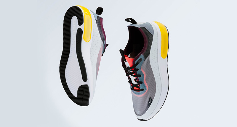


<!-- One item + Dots + Loop (defaults) -->
<div class="tns-carousel tns-nav-enabled">
  <div class="tns-carousel-inner">
    <img src="path-to-image" alt="Alt text">
    <img src="path-to-image" alt="Alt text">
    <img src="path-to-image" alt="Alt text">
  </div>
</div>
// One item + Dots + Loop (defaults)
.tns-carousel.tns-nav-enabled
.tns-carousel-inner
img(src="path-to-image", alt="Alt text")
img(src="path-to-image", alt="Alt text")
img(src="path-to-image", alt="Alt text")
One item + Static controls + Dots inside + No loop
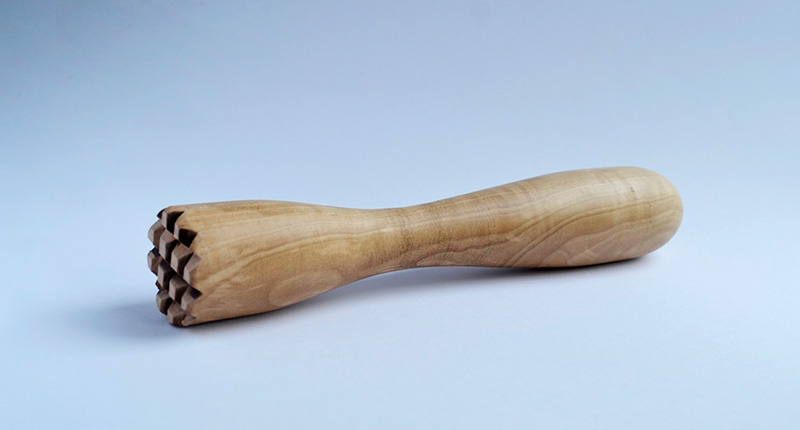
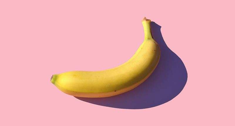

<!-- One item + Static controls + Dots inside + No loop -->
<div class="tns-carousel tns-controls-static tns-nav-enabled tns-nav-light tns-nav-inside">
  <div class="tns-carousel-inner" data-carousel-options='{"loop": false}'>
    <img src="path-to-image" alt="Alt text">
    <img src="path-to-image" alt="Alt text">
    <img src="path-to-image" alt="Alt text">
  </div>
</div>
// One item + Static controls + Dots inside + No loop
.tns-carousel.tns-controls-static.tns-nav-enabled.tns-nav-light.tns-nav-inside
.tns-carousel-inner(data-carousel-options='{"loop": false}')
img(src="path-to-image", alt="Alt text")
img(src="path-to-image", alt="Alt text")
img(src="path-to-image", alt="Alt text")
Vertical carousel + No dots


<!-- Vertical carousel + Loop + No dots -->
<div class="tns-carousel">
  <div class="tns-carousel-inner" data-carousel-options='{"axis": "vertical", "nav": false}'>
    <img src="path-to-image" alt="Alt text">
    <img src="path-to-image" alt="Alt text">
    <img src="path-to-image" alt="Alt text">
  </div>
</div>
// Vertical carousel + Loop + No dots
.tns-carousel
.tns-carousel-inner(data-carousel-options='{"axis": "vertical", "nav": false}')
img(src="path-to-image", alt="Alt text")
img(src="path-to-image", alt="Alt text")
img(src="path-to-image", alt="Alt text")
Multiple items + Static controls outside + No dots + Loop (Responsive)


<!-- Multiple items + Static controls outside + No dots + Loop (Responsive) -->
<div class="tns-carousel tns-controls-static tns-controls-outside">
  <div class="tns-carousel-inner" data-carousel-options='{"items": 3, "nav": false, "responsive": {"0":{"items":1},"500":{"items":2, "gutter": 18},"768":{"items":3, "gutter": 20}, "1100":{"gutter": 24}}}'>
    <img src="path-to-image" alt="Alt text">
    <img src="path-to-image" alt="Alt text">
    <img src="path-to-image" alt="Alt text">
    <img src="path-to-image" alt="Alt text">
  </div>
</div>
// Multiple items + Static controls outside + No dots + Loop (Responsive)
.tns-carousel.tns-controls-static.tns-controls-outside
.tns-carousel-inner(data-carousel-options='{"items": 3, "nav": false, "responsive": {"0":{"items":1},"500":{"items":2, "gutter": 18},"768":{"items":3, "gutter": 20}, "1100":{"gutter": 24}}}')
img(src="path-to-image", alt="Alt text")
img(src="path-to-image", alt="Alt text")
img(src="path-to-image", alt="Alt text")
img(src="path-to-image", alt="Alt text")
One item + Fade transition + Dots + Loop


<!-- One item + Fade transition + Dots + Loop -->
<div class="tns-carousel tns-nav-enabled">
  <div class="tns-carousel-inner data-carousel-options='{"mode": "gallery", "speed": 1000}'">
    <img src="path-to-image" alt="Alt text">
    <img src="path-to-image" alt="Alt text">
    <img src="path-to-image" alt="Alt text">
  </div>
</div>
// One item + Fade transition + Dots + Loop
.tns-carousel.tns-nav-enabled
.tns-carousel-inner(data-carousel-options='{"mode": "gallery", "speed": 1000}')
img(src="path-to-image", alt"Alt text")
img(src="path-to-image", alt"Alt text")
img(src="path-to-image", alt"Alt text")
Fade transition + Layer animations
From top to bottom
From bottom to top
From left to right
From right to left
<!-- Fade transition + Layer animations -->
<div class="tns-carousel">
  <div class="tns-carousel-inner" data-carousel-options='{"mode": "gallery", "nav": false}'>
    <div>
      <div class="bg-faded-primary text-center py-5 px-3">
        <h3 class="from-top">From top to bottom</h3>
        <p class="fs-lg mb-4 pb-3 from-bottom delay-1">From bottom to top</p>
        <button class="btn btn-primary scale-down delay-2" type="button">Scale down</button>
      </div>
    </div>
    <div>
      <div class="bg-faded-success text-center py-5 px-3">
        <h3 class="from-start">From left to right</h3>
        <p class="fs-lg mb-4 pb-3 from-end">From right to left</p>
        <button class="btn btn-success scale-up delay-2" type="button">Scale up</button>
      </div>
    </div>
  </div>
</div>
// Fade transition + Layer animations
.tns-carousel
.tns-carousel-inner(data-carousel-options = '{"mode": "gallery", "nav": false}')
div
.bg-faded-primary.text-center.py-5.px-3
h3.from-top From top to bottom
p.fs-lg.mb-4.pb-3.from-bottom.delay-1 From bottom to top
button(type="button").btn.btn-primary.scale-down.delay-2
| Scale down
div
.bg-faded-success.text-center.py-5.px-3
h3.from-start From left to right
p.fs-lg.mb-4.pb-3.from-end From right to left
button(type="button").btn.btn-success.scale-up.delay-2
| Scale up